Thursday 23 January 2014

Game engines and Different types of graphics


The two types of graphics I will be discussing are vector graphics and pixel graphics they both have advantages and disadvantages; I’ll start by comparing these;

Bitmap graphics are made up of pixels (which are tiny squares) of different colours, these are arranged to make an image; you can see these pixels when you zoom in on an image. When you edit an image made up of pixels, you have more control; you will be able to edit each and every pixel of an image (adding more pixels, changing colour, removing pixels). Programs such as Adobe photoshop, GIMP, paint tool sai, etc. will allow you to edit these pixels.
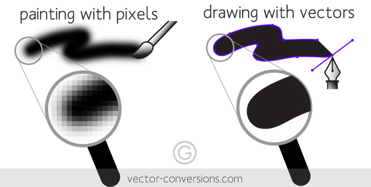
On the other hand vector graphics are made up of objects instead of pixels and they use mathematical formulas to draw lines and curves which then can be used to make objects which then make up the image, to edit vector graphics you have to change the lines and curves that make up the objects, programs such as adobe illustrator and Corel draw allow you to manipulate these lines and curves.

Vector images are more scalable than pixels, when you scale pixel images you will lose the quality because it scales each of the pixels and you will be able to see the tiny squares of different colours that make up the image this is most noticeable on the edge of an image. There are ways of getting around this problem but then the whole image will get blurry. Vector on the other hand uses formulas instead of pixels so it uses that to redraw the lines resulting in no loss of quality.

Vector images have advantages over pixel because they are smaller in file size this is because pixel images have to store information for each and every pixel such as the colour of the pixel, while vector just stores the formula that makes the image. Disadvantage of using vector is that it isn’t supported on the internet (websites), most popular format used to display images are JPEG which are pixels. There are few ways of getting an vector image on the web, you must rasterize it in Photoshop or you have to use adobe flash to make the format into SWF. 

Vector is good for logo design or images that don’t have colour gradient such as some style of cartoons and animations, while pixel should be used for photos and images with a lot of colour gradient and Varity.


What is a game engine and what is it's purpose?
A game engine is what makes a game function. It’s a tool you will use to make your game, however it is incomplete because it doesn’t contain every cog and gear that will make your game work, however it contains the basics which allow the developers to focus on other things such as the detail that will go into their game instead of making everything from scratch which will make it more time consuming so a game engine basically contains reusable software components. It is the core of the game, and game developers use these to cut down the time spent on developing, because the game engines already contain the basics, such as the graphics, AI functions; If the developer wanted something advance they would have to make that themselves and implement it into the engine.


The game engine controls everything such as rendering, physics, Interface, AI, loading, etc. However it doesn’t make the game, it only brings it to life. The models, textures and how everything interacts with each other in the game environment; is what makes the games and not the game engine. Some examples of game engines are UDK (Unreal development kit), Cryengine and frostbite.  Each game engine is different to each other, some are good at one thing the others are good at something else. Like how some cars are good at accelerating while using a lot of fuel on the other hand some cars are good at using less fuel but taking longer to get to the destination.
 

Animation gallery

This is where I've placed most of the animations that I made, these are the final versions. I've left out the sketches and the skeleton animations. Click Read more to see them all...

dragon dying

Final animation that I needed to do was the dragon dying, like I explained few posts ago; hand drawing it each frame and cell shading it would take way to long, so I basically cut the dragon up with polyognal lasso tool again and drew blood on each frame, I used dark red and bright red for the highlights, i wanted it to have some depth and varity.
It is still a bit fast and I might make some more adjustments if I have time, but in my opinion this looks decent enough to go in the game.

Fire beam

After I was done with the previous animation, I went onto doing the flame beam for that animation. I wanted it to be on a different document because then the designer could make it attack or spawn in, plus he would have more control if the animation was done on a separate document.
For making the beam I made a pencil/ charcoal brush which had a grunge feel to it; I held shift and drew two straight lines for the edge of the beams, then for the inside colour I made it orange and added lines that were yellow, then I used the effect gaussian blur on the yellow lines layer which then was duplicated and set to overlay mode. I did a few more layers until I got something that I wanted. Finally, for animating it I basically had it come out of the frame to when it was fully visible.
to make it feel more alive and blazing I made one of the layers with the lines on to move around when the whole flame beam was in frame.

Fixing the animation problem for dragon

After facing the problem of not being able to keep the same quality of detail on the dragon with hand-drawn animations, I decided to use the polygonal lasso tool to cut the jaw of the cell shaded dragon and I placed it on a different layer where I could edit it and or copy/ modify.

I then set the anchor point to the edge of the jaw so when I rotate, the back of the jaw would not move. I created 21 frames after that and animated the jaw opening and closing on this length. After this I set the playback of each of the frames to 0.07 seconds which allowed for it to be smoother, for the opening of the jaw there was no ease in, it was rapid but for the closing there was a small ease in.

After this was done, it looked weird because there was no tongue or teeth, so I went over each of the frames and drew in the teeth, for the tongue I drew it on a separate layer because that needed cell shading.
I think it turned out alright since I just animated it from a still animation.

Dragon attacking animation


I outlined the sketch from the last post with a default brush because I didn't have my own inking brushes preset at college, I could have used the pen tool and stimulate pressure and make it look like it's been inked, but that would take way too long. I was running out of time and I also had to think about the other animation I needed to make for the dragon, such as the idle, dying, etc.

After I finished outlining the dragon I had to add colour and make it match this
which was what I wanted the dragon to look like, after doing the first frame, I realised that it would take way too long and for some reason I could not get the colours right also I could not use the fill tool or the magic wand tool since the brush I used for outlining had a softness to it and that left pixels which were shades of grey. This posed a massive problem since I had to give the designer some time to import and implement the dragon into the game, and the deadline was close, So I decided to scrap that idea of me going over each frame and colouring it by hand; after which I would have to go over it again and add shading, then finally I would have to go over it again to add highlights.


Thursday 16 January 2014

Dragon

I went over that skeleton sketch I posted few days ago, This is 2/4 passes, the first was the skeleton sketch, the second was this, getting the basic form done, the third would be going over this and placing the lines precisely and getting the proportions right the final step would be to add colour and make final adjustments.
I think I'll have to make the flames on a separate document because we'll use the bullet feature in construct to make him shoot out the flames instead of them being attached to the animation.

Animation for dying

The designer said that we needed an animation for when the players die, so we reused the falling animation and cut off the part where the players gets up, instead we had the player stay on the ground and change the eyes to crosses to signify that the player is now dead.


Wednesday 15 January 2014

Animation for dragon

I did a skeleton sketch for one of the dragon attack animations;
I will now have to go over each frame and draw the dragon on the skeleton. for a fully hand drawn animation i think it's easier if you have a skeleton to work on top of. I can't really use motion tweening anymore and I may not do this animation in Adobe flash because I'm not good at cell shading in flash.
  

I've changed the style of the dragon as well, I didn't like the first one so I did some research on dragons and built a mini mood board. This time I used a brush with pressure on the thickness of the lines, you can see this when you look at the horns, it doesn't have lines which are the same thickness from starting to the end. also this time I used the colours more efficiently, light source is set above the head, and you can now see the highlight. This looks more refined than the previous drawing of the dragon.
I might change the colour of the dragon, which should be easy since I have all the colours on different layers.

Thursday 9 January 2014

Boss

We are currently debating on having a boss monster, so I already drew concept of it, I asked my team about what the monster should be like and i was told that it's my choice; so therefore I chose a dragon as the boss.
I made an animated GIF of my work process, I first started with the line art, after tweaking it I went to add the base colours for the horns, teeth and the claws. after that I added the highlights and shadows, then I added the red streak near the eye glow and finally I used "colour balance" to bring out the golden horns and claws.
Animating this will prove to be a challenge, but I'll try my best, I drew this in Photoshop so now I'm going to try and re-draw it in flash where animation will be smoother, if i find that to be way to hard or time consuming then I shall settle for Photoshop's choppy animation.

Falling down and jumping up

I've also created falling animation for when the player gets hurt, I would like to add blood but i don't really know how that is going to work in construct. I've got 1 final thing i need to do for the characters; I just got the jump animation to make and then I'm done, I will then move onto create a start screen and the boss monster.
The characters were missing a jump animation, I noticed that movement didn't seem real when we were play testing and I now have jump animation for both player 1 and 2.

Player 2

I've now done all the animations for player 2, doing the post effects went a lot quicker this time around, because i knew all the shortcuts and tricks to save some time. just for reference here are all the gifs for player 2.


GIF size and rig

I've fixed all the resolution problems and now all the GIFs are 300 x 300 pixels, it was a good idea to make a rig of sorts because my next step is to make "player 2" which is going to be the same character but just a different colour and will have a different 'ultimate move'
the reason for having the second player be the same model but a different colour is because it would lessen the workload, because most of the time will be spent on making a boss monster.

I now still have to add post effects to all the GIFs for second player, and these are done frame by frame, so it takes a little longer than actual making of the animation.

Friday 20 December 2013

Problems

I've ran into a lot of problems before the demo, the designer started importing the gifs into construct and first problem i came across is that all the gif sizes are different; if you scaled them then they would go blurry. to fix that i went into adobe flash and tried to scale them all to 300 by 300 pixels, another problem i ran into was that the flash files won't open properly since i used different versions of flash, so instead of wasting time scaling each frame, I decided to make a rig for the character, and I made sure each aspect of the character was a symbol so i could create motion tweens.

Thursday 12 December 2013

Creating attackmation

So I started working on one of the attack moves, I didn't really plan this out, I was experimenting with random sketches when I stumbled upon to this idea of making it a beam attack. I let you see for yourself.

This is how the end result is, it took a lot of time because I had to mess with a lot of different settings, change formats and import the frames 1 by 1 into photoshop, just so I could enhance the visuals.

The different stages of the animations;
I first started this in flash CS3, where I basically had drawn a rough sketch of all the frames, just to get a good idea of where everything will go when I'm done. Then I went over the sketch frame by frame till all the lines were right, I had some limbs that would not move and so I change the whole character into a symbol so I could move it more smoothly, I used motion tween (this is way of making an object move from point a to b smoothly) on the hands for part of the way, so it looks way smoother.
here is what it looked like when I was done in flash, so the next step was to add colour and remove the floor.
So all the colours are flat at this moment, and when I say colours I really do mean colours because the hands and feet are supposed to be white so they actually show up on the backgrounds. Then I had to spend time on finding out how to export it to photoshop, after some time I got it to work in photoshop where I went and added the finer details such as the shadow that shows up when the beam starts, that's because the beam does emit light, also I added a red glow to the back of the beam so it's easily visible and gives it more of an aggressive feel.

Style of art

following my previous post, I have continued to work on different styles to see what looks best, in my last post I said that stick animation is more fluid, it's simple to do but takes patients. I spoke to my team, they said I should decided what we use for the game, so I think I'll pretty much discard this style of animations, seeing as it won't fit in with the backgrounds from the other artist.

This is a the walk cycle for the character we will use, I might change the colours around a bit, and also make another similar character that will be player controlled. For this animation above I didn't want to keep re-drawing the head so I basically converted it into a symbol and all the other moving parts into 'graphics'. This saved me sometime, but i think if i had drawn it by hand it would have taken more time but would have a unique flow to it.

For all the animations I draw a floor, before I start drawing because then I can align everything easily.
This was a stomping move, it was one of the attacks i thought we might use, but this was the sketching stage and i decide to drop this attack animations, because that looks way better.
This is one of the special moves, and I shall refine this animation more after I am done with my current animation, this movement is the same as my pitch, but it'll be more fluid than this.

Thursday 5 December 2013

Week 2

We got into groups now and I have to design the characters for the project, in my  team we have 2 artists so we can have more detailed animations and such. I will be designing the new characters, we had a group meeting where we discussed different parts of the game/ elements. My team suggested we keep the characters as spheres/ovals and just change their appearance a little bit. I told the designer that I will get some ideas down and show him each and every idea, this way we will be able to see which one would work best for our game.

 So I started doing some animations in flash, because it's much easier than photoshop and the animations are more fluid and smooth; I started with a stick man animation which was really smooth and I thought would look great in a beat 'em up game because you would be able to see all the joints, hands, feet and the head. however that would mean that we change the art style of the game, also I don't want anyone to think that I was too lazy to make a proper character. one last note about the stick style is that, I have seen flash which just used stick men but the way they were presented made them much more than that, for example there are a series of flash fighting scenes where two stick men fight to death, the punch and the whole fight in general looks believable.


 This is the same style as my pitch GIF, this kind of style can work for a fighting game, this is beacuse i've seen a flash game called "smiley wars" which is basically circles killing other circles with guns. I can do this style easily, but it's not as believable as the stick men.


I can still repersent differenct characters on screen by giving them a different experession and or changing their colour. I might have to make a whole different character, beacuse I want to see what looks best and what performs best.


Friday 29 November 2013

Week 1

Today I started working on my loop animation for the presentation that will take place in a month, I don't really have any idea of what i want to make, all i know is that it has to be a pixelated GIF.

I got some ideas down for what i would like to show everyone, i wanted it to be something that represented me in a way that tells everyone that I'm good at both animation and visuals. So I got inspiration from another game (street fighter) due to the catchy phrase for one of the moves; 'Hadouken', however that doesn't really show the character moving around, so I decided to do another move from that game, 'shoryuken' which is an upper cut.

I didn't want to spend too long on this so i didn't add too much detail into the character, i thought that was unnecessary. I wanted it to be simple because i knew, i would have to draw it frame by frame. If it was too complex then it would take more than one week.

My design looks like a sphere/oval with little circles for hands and feet. It's simple but you can still show movement with the hands and feet. I didn't really think about the colour when i started this but, after i was done drawing each frame I went in and add different shades of grey to make it seem more 3d/ give more depth.

Before adding the victim who gets punched, I animated the punch for 24 frames with a 0.1 frame delay, this would make sure that each frame is visible but not too slow. I just animated the motion of the uppercut with no effects (the blue glow and the blood or the victim), after that process was done I went and added neon blue glow and streaks to the hand as the punch was being unleashed, then I wanted a victim and so I made him stand out by giving him a bright yellow with shade and red spikes. I animated the victim to walk up and get hit just at the right time, I spent even less time on this second character because he would only be in the scene to get punched.
After I was done with the characters, I wanted to do a simple background because currently it was on a white background and it didn't look finished, also I wanted to show that I can do a bit of backgrounds as well so I decided to draw in some trees and clouds. Finally I went and colour corrected everything, added blurs where they were needed for example the streaks of the upper cut and the glow of the sky, clouds and the shadow near the tree trunks.
I was mostly proud of this GIF, considering the amount of time I spent on it.